Savvy Pig
UX/UI Case Study | Responsive Web App
The Objective
Savvy Pig is an intuitive financial saving app designed to empower users to take control of their finances. I created the concept, name, brand guidelines and overall design. By blending a professional tone with playful imagery, the app removes the intimidation of money management, simplifying expense tracking and savings goals to help users confidently achieve their milestones.
The Process
-
Concept
I created SavvyPig by formulating a precise problem statement and conducting a comprehensive competitor analysis, enabling me to determine the core features for this responsive financial management application.
-
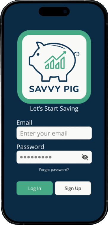
Logo and Brand Guidelines
I crafted a professional yet welcoming brand identity for SavvyPig, utilizing primary colors symbolizing trust and growth, and designing the logo for clear legibility across various platforms.
-
Design
I spearheaded the entire design phase, creating comprehensive wireframes, interactive prototypes, and detailed mockups to build an accessible and engaging financial management experience.
-
Test
Through A/B testing and user testing I validated SavvyPig's design effectiveness, gathering crucial feedback to ensure the financial management solution is intuitive and highly user-friendly.
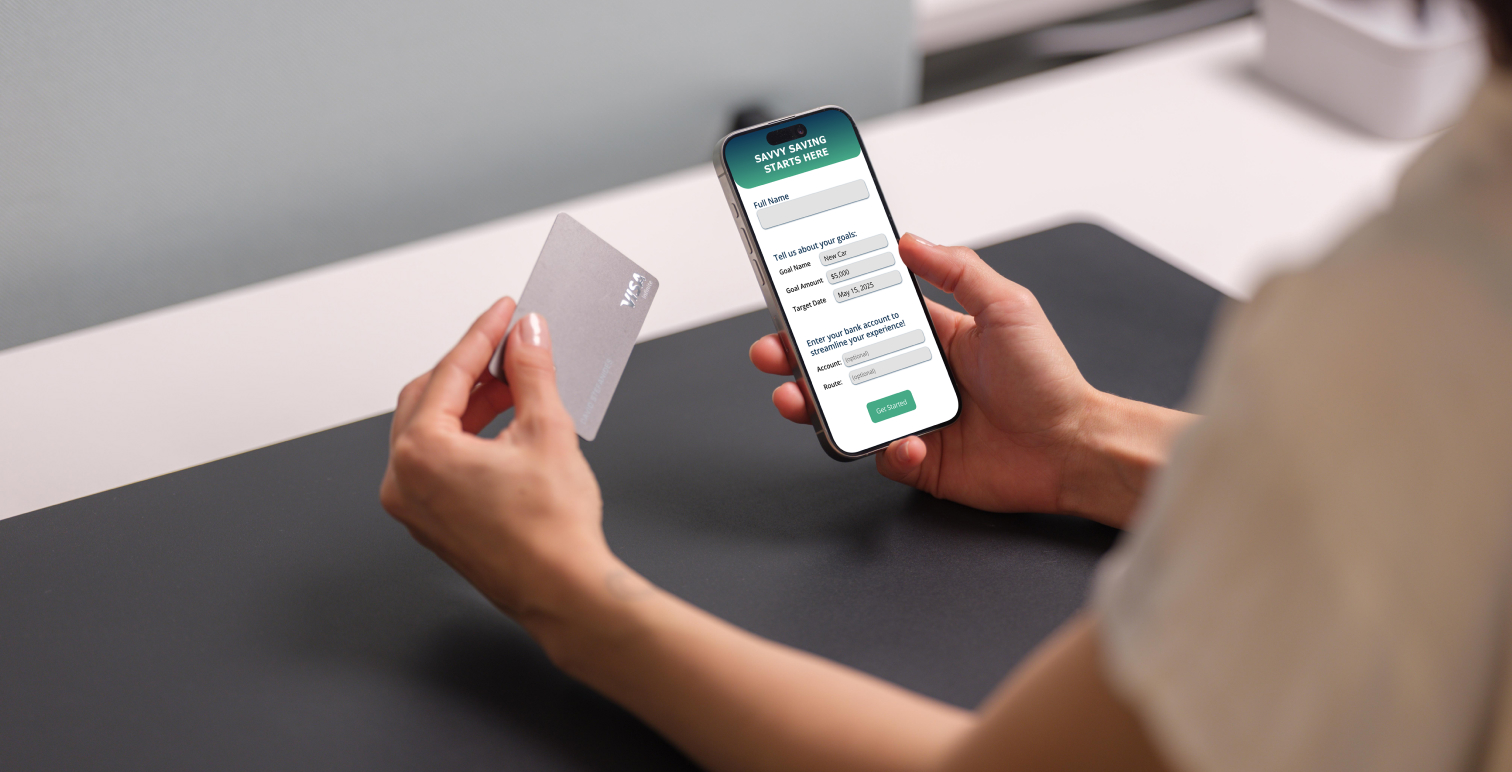
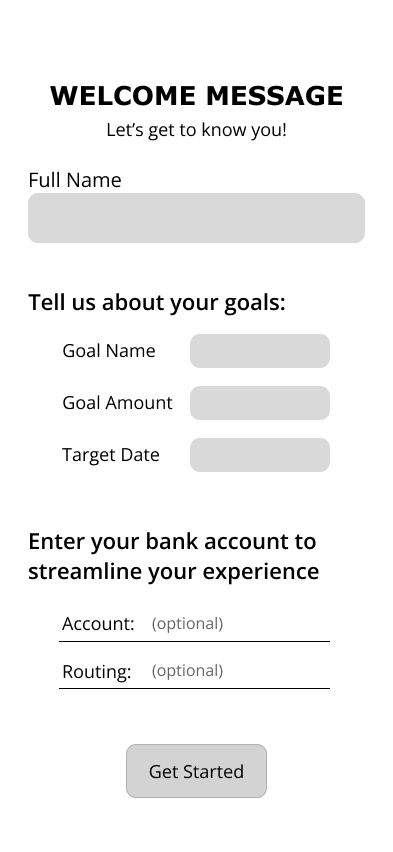
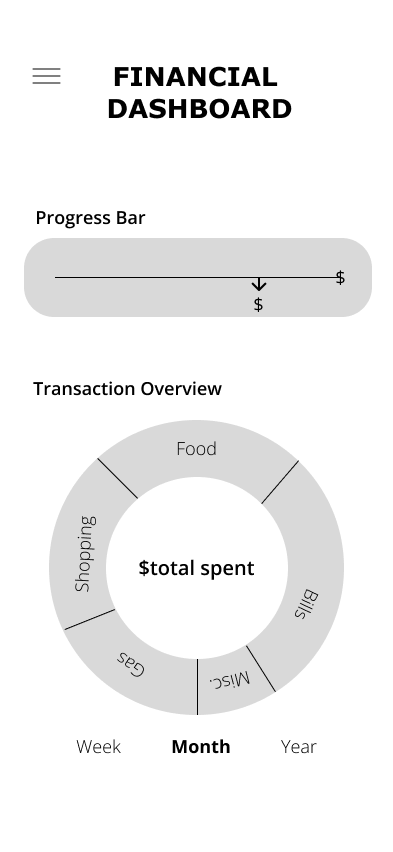
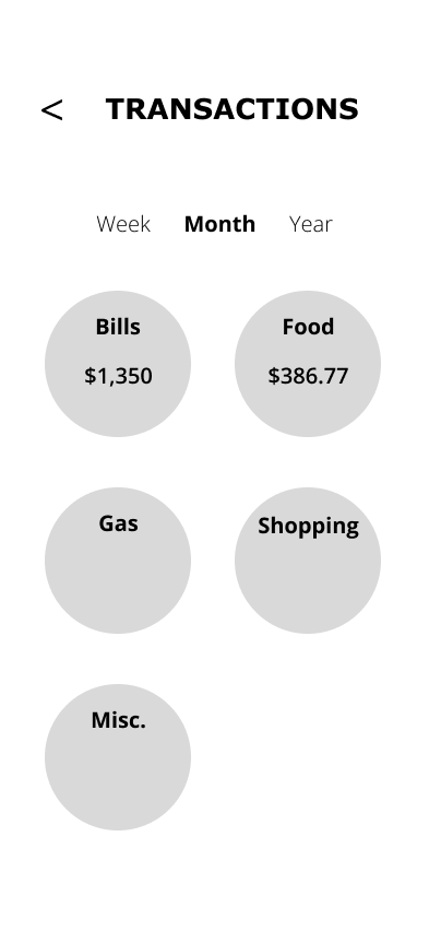
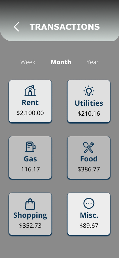
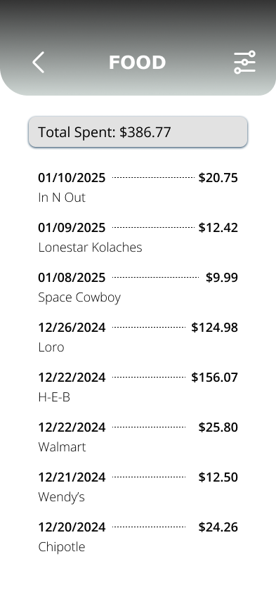
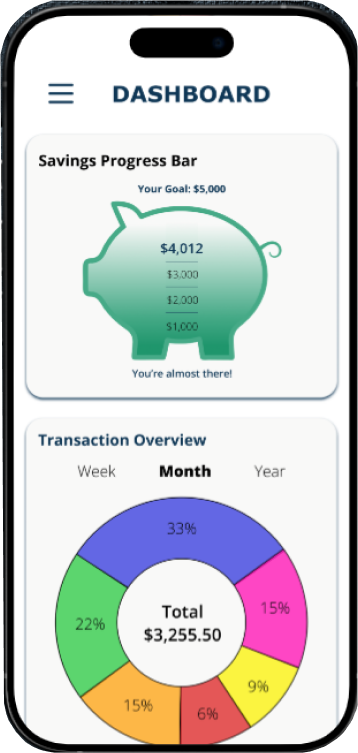
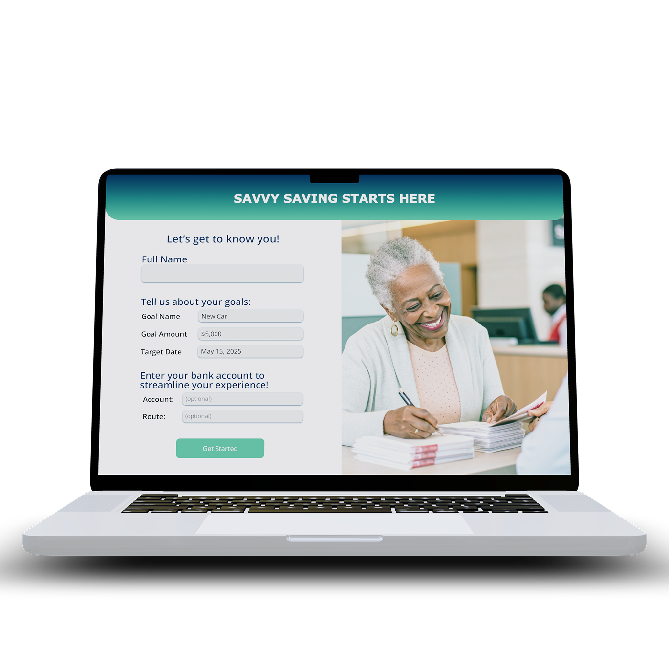
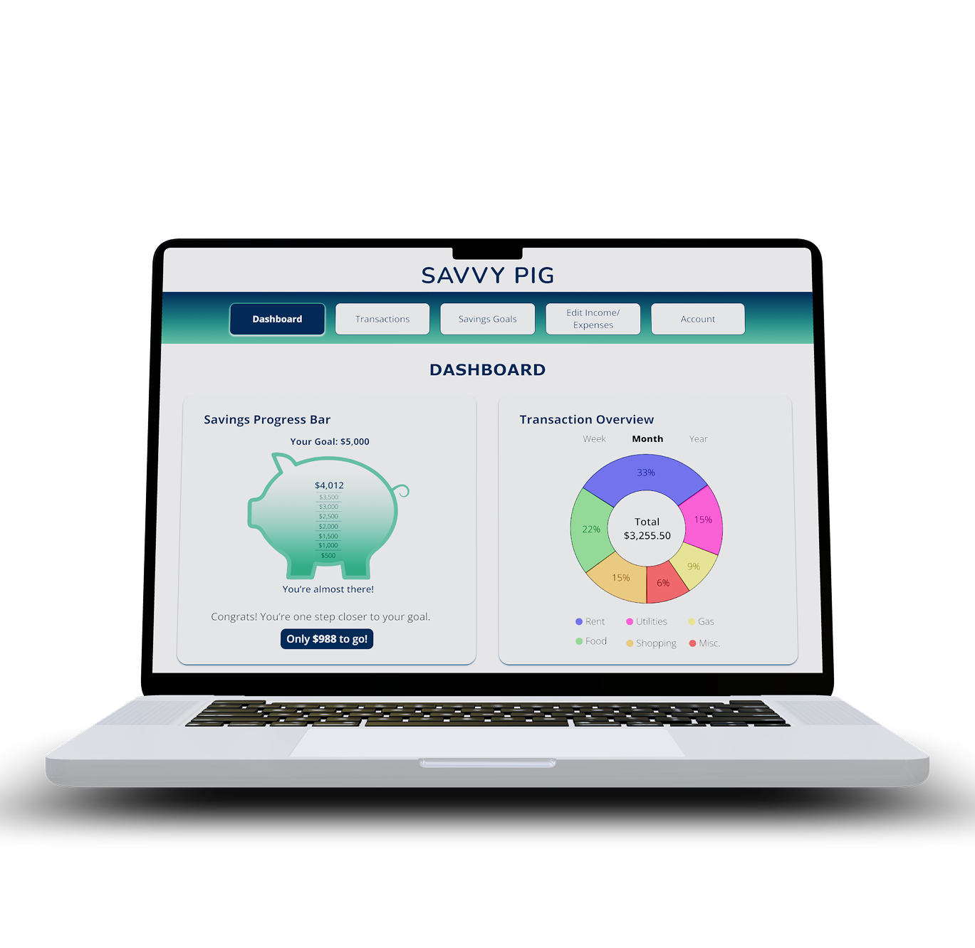
Users Can...
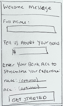
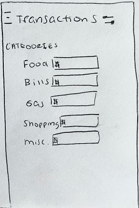
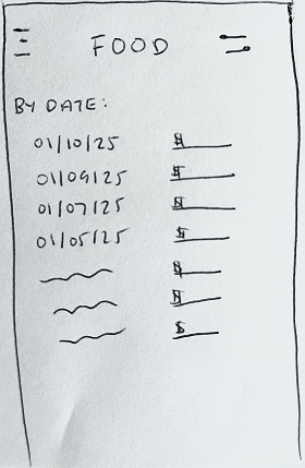
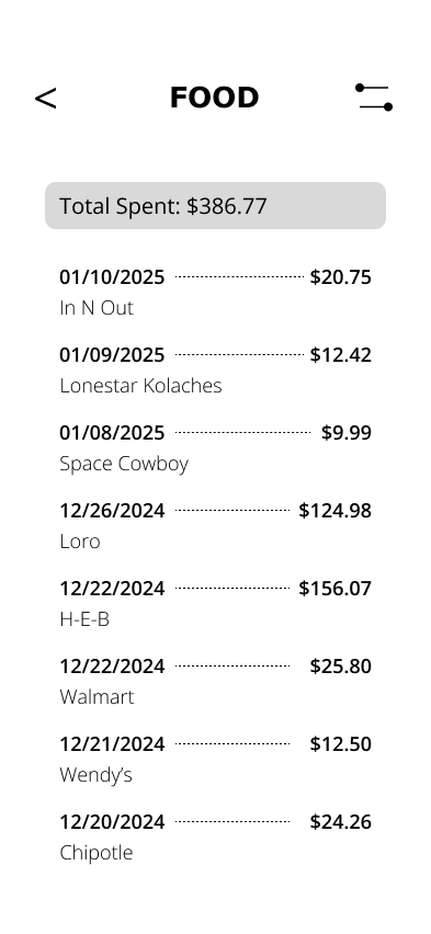
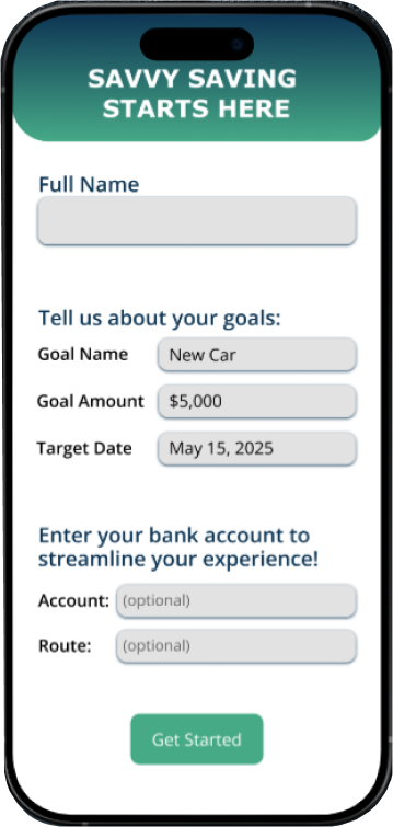
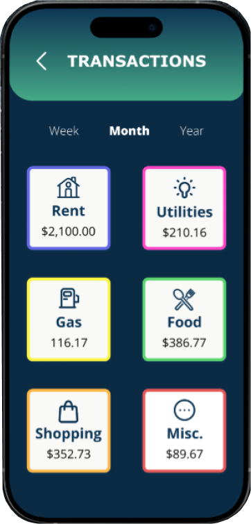
- Track Expenses and Income: view detailed transation history, as well as log income within categories.
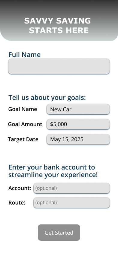
- Set Savings Goals: define a goal name, amount and a target completion date.
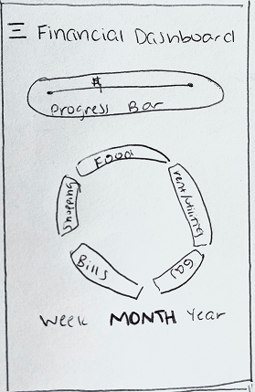
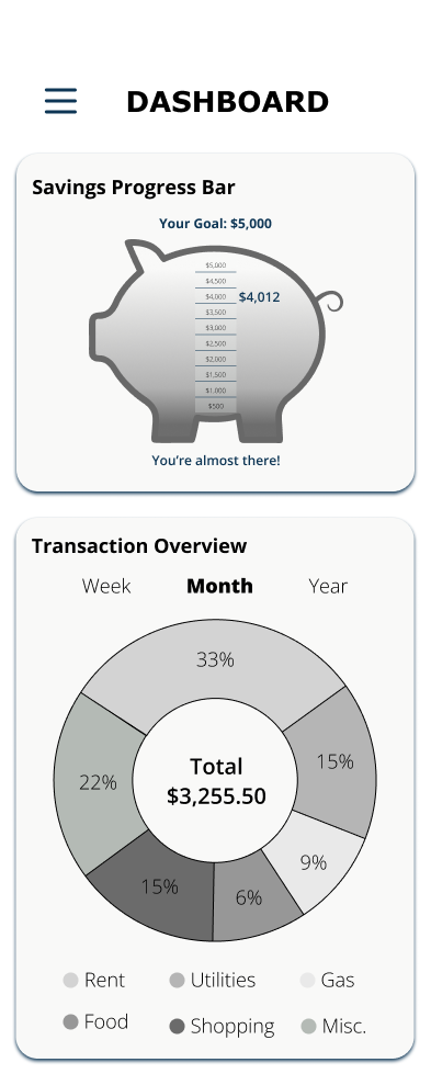
- Visualize Financial Data: access a dashboard displaying spending categories, saving progress, and view trends in financial habits over time.
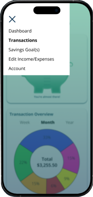
User Flows
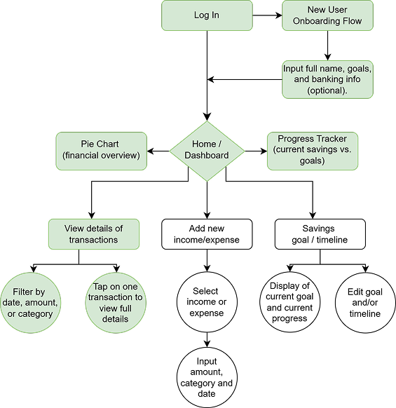
The highlighted portion represents the flow of the design you are seeing in this case study.
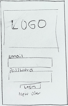
Wireframes
Low Fidelity
(Sroll to view more)
Mid Fidelity
(Scroll to view more)
High Fidelity
(Scroll to view more)

Style Guide
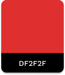
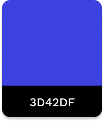
COLORS
Primary Colors
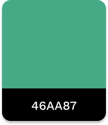
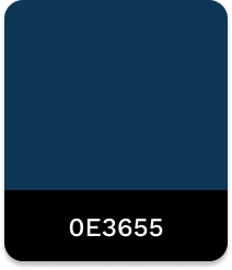
These colors convey a professional yet welcoming tone, symbolizing both trust and growth.
Secondary Colors
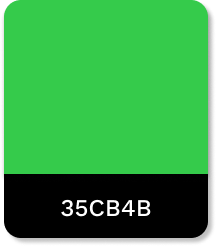
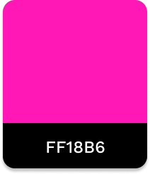
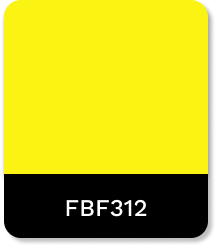
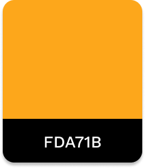
These bold shades are used for illustrations like graphs and charts, ensuring accessibility.
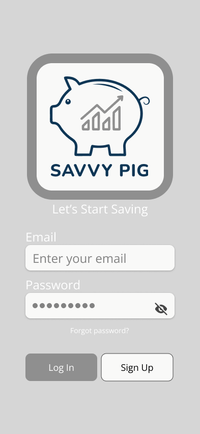
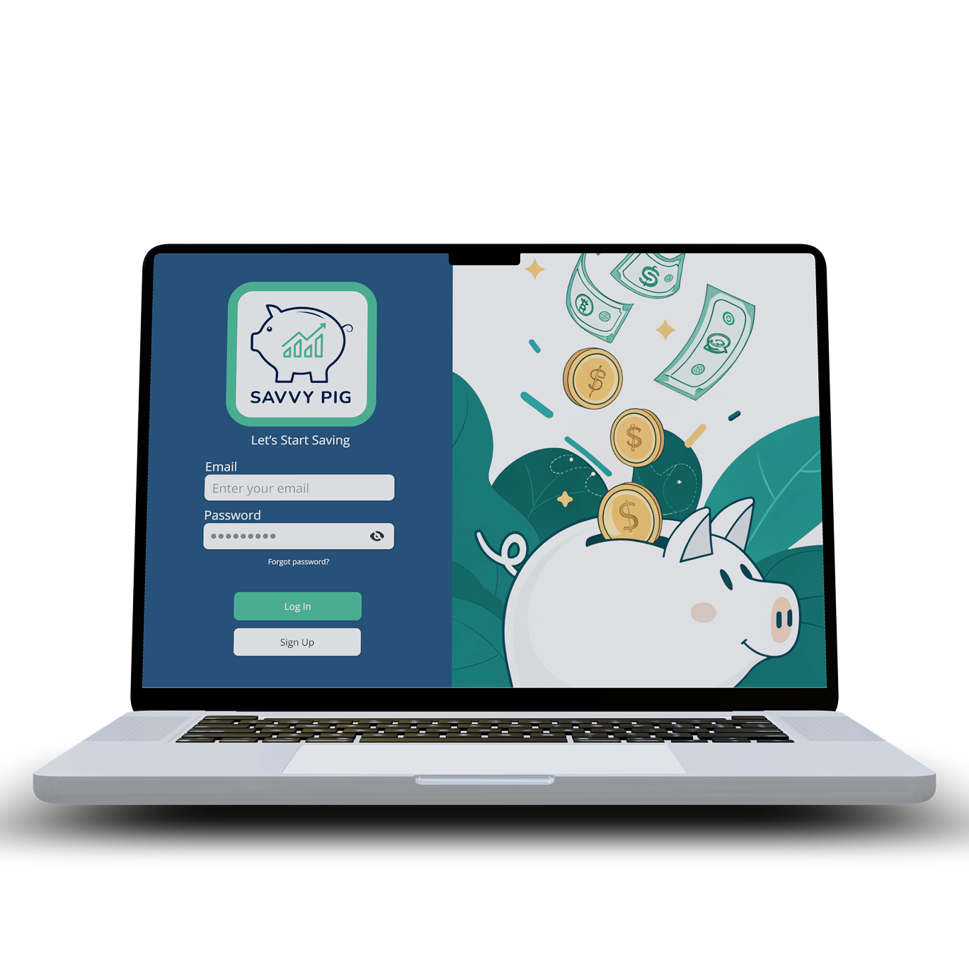
LOGO


The logotype and Logo Outline designs ensures legibility and maintains brand recognition in smaller spaces, such as app icons, navigation bars, and footers.
LOGO TYPOGRAPHY
Nunito ExtraBold - the logotype must remain as is due to special kerning. It also must remain in #0E3655.
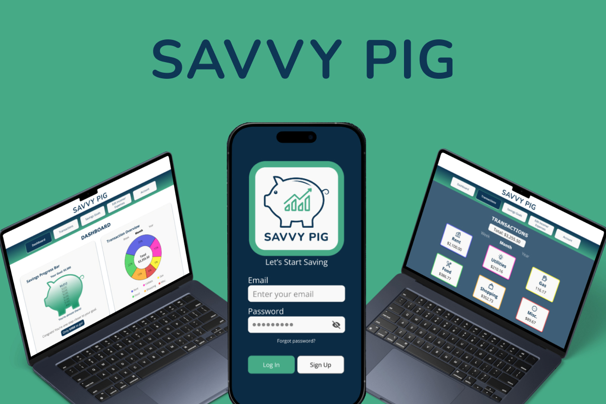
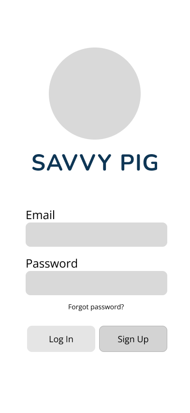
Mockups
(Scroll to view more)
Conclusion
The Savvy Pig project showcases my end-to-end design process, from the initial conceptualization and branding – including the development of the name and logo – through to the creation of a user-friendly and effective financial application.
Recognizing the intimidation often associated with personal finance, the core objective was to design an intuitive experience centered around clear expense tracking, motivating goal-setting features, and easily understandable data visualization. By carefully blending a professional aesthetic with playful visual elements, Savvy Pig aims to demystify money management and empower users, regardless of their financial literacy, to confidently take control of their financial journey and achieve their savings milestones. This case study reflects my commitment to creating accessible, engaging, and impactful digital solutions that address real user needs and foster positive outcomes.